 Panel Page
The Panel page specifies how the background and border of the chart appears.
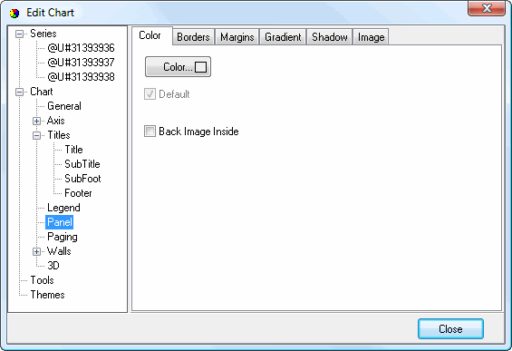
The Color subpage has the following options:
Color: click this button to display a dialog in which you can select the background color.
Default: turn this setting on to use the default background color.
Back Image Inside: turn this setting on to use the image as the background of the chart area or off to use it as the background for the entire chart shape.
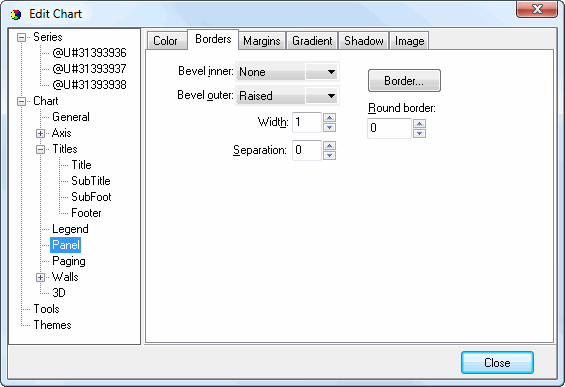
The Borders subpage has the following options:
Bevel inner: this option allows you to specify an inner bevel for the panel.
Bevel outer: this option allows you to specify an outer bevel for the panel.
Width: the width of the bevels.
Separation: this specifies the amount of separation between the inner and outer bevels.
Border: click this button to display the Border Editor dialog.
Round border: this setting specifies the degree of roundedness for the border corners.
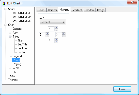
The Margins subpage has the following options:
Units: determines what units the numeric settings in this page have. The choices are:
Percent: the values are a percentage of the panel size.
Pixels: the values are in pixels.
Left: the left margin.
Top: the top margin.
Right: the right margin.
Bottom: the bottom margin.
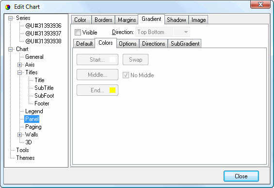
The Gradient subpage controls the gradient settings for the panel. It has the same settings as the Gradient Editor dialog.
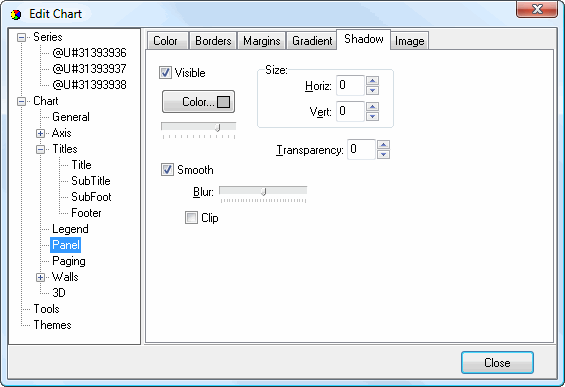
The Shadow subpage has the same options as the Shadow Editor dialog.
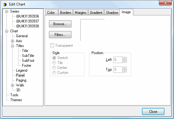
The Image subpage has the following options:
Browse: click this button to display a dialog from which you can select the image file to use for the picture.
Filters: brings up the Filters Editor so you can apply various graphic effects to the image.
Transparent: turn this setting on to display a transparent picture.
Style: this controls how the picture is formatted if the image is a different size than the symbol. The choices are:
Stretch: the image is stretched to fit the symbol.
Tile: the image is tiled to fit the symbol.
Center: the image is centered on the symbol.
Custom: turn this option on to specify where the image should be positioned using the Left and Top controls.
© Stonefield Software Inc., 2025 • Updated: 06/07/16
Comment or report problem with topic